Fraktur (script)
From Wikipedia, the free encyclopedia
| Latin script (Fraktur variant) | |
|---|---|
 | |
| Type | Alphabet |
| Spoken languages | German¹ and some other European languages |
| Time period | 16th – mid-20th centuries |
| Parent systems | Blackletter
|
| Child systems | Kurrentschrift, including Sütterlin |
| Sister systems | See Blackletter |
| Unicode range | 0020–00FF² |
| ISO 15924 | Latf |
| Note: This page may contain IPA phonetic symbols. | |
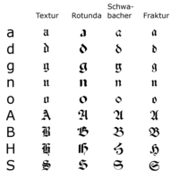
The term "Fraktur" is sometimes applied to all of the blackletter typefaces (known in German as Gebrochene Schrift).
Contents[hide] |
[edit] Characteristics
Besides the 26 letters of the Latin alphabet, and the ß (Eszett [ɛsˈtsɛt]) and vowels with umlauts as well, Fraktur typefaces include the ſ (long s), sometimes a variant form of the letter r, and a variety of ligatures once intended to aid the typesetter and which have specialized rules for their use. Most older Fraktur typefaces make no distinction between the majuscules "I" and "J" (where the common shape is more suggestive of a "J"), even though the minuscules "i" and "j" are differentiated.One difference between the Fraktur and other blackletter scripts is that in the small-letter o, the left part of the bow is broken, but the right part is not.
[edit] Origin
The first Fraktur typeface was designed when Holy Roman Emperor Maximilian I (c. 1493–1519) established a series of books and had a new typeface created specifically for this purpose, designed by Hieronymus Andreae. Fraktur quickly overtook the earlier Schwabacher and Textualis typefaces in popularity, and a wide variety of Fraktur fonts were carved.[edit] Use
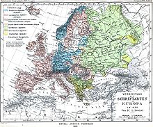
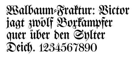
Typesetting in Fraktur was still very common in the early 20th century in all German-speaking countries and areas, as well as in Norway, Estonia, and Latvia, and was still used to a very small extent in Sweden, Finland and Denmark[1] (see below: Usage map), while other countries typeset in Antiqua in the early 20th century. Some books at that time used related blackletter fonts such as Schwabacher; however, the predominant typeface was the Normalfraktur (Fig. 1), which came in slight variations.Since the late 18th century, Fraktur had been progressively replaced by Antiqua as a symbol of the classicist age and emerging cosmopolitanism. The debate surrounding this move is known as the Antiqua-Fraktur dispute. The shift affected mostly scientific writing, whereas most belletristic literature and newspapers continued to be printed in broken fonts. This radically changed when on January 3, 1941, Martin Bormann issued a circular to all public offices which declared Fraktur (and its corollary, the Sütterlin-based handwriting) to be Judenlettern (Jewish letters) and prohibited their further use. It has been speculated by German historian Albert Kapr that the régime had realized that Fraktur would inhibit communication in the territories occupied during World War II.[2] Fraktur saw a short resurgence after the War, but quickly disappeared in a Germany keen on modernising its appearance.
Fraktur is today used mostly for decorative typesetting; for example, a number of traditional German newspapers such as the Frankfurter Allgemeine, as well as the Norwegian Aftenposten, still print their name in Fraktur on the masthead, and it is also popular for pub signs and the like. In this modern decorative use, the Fraktur rules about the use of long s and short s and of ligatures are often disregarded.
Individual Fraktur letters appear frequently in mathematics, which often denotes associated or parallel concepts by a single letter in various fonts. For example, a Lie group is often denoted by G, while its associated Lie algebra is 𝔤. A ring ideal might be named 𝔞 while an element is a ∈ 𝔞.
[edit] Fraktur in Unicode
In Unicode, Fraktur is considered a font of the Latin script, and is not encoded separately. The additional ligatures that are required for fraktur fonts will not be encoded in Unicode.[1] Instead, Unicode proposes to deal with these ligatures using smart-font technologies such as OpenType, AAT or Graphite. There are many fraktur fonts that do not use smart-font technologies but use their own legacy encoding instead that is not compliant with Unicode.There are Fraktur symbols in the Unicode blocks of mathematical alphanumeric symbols and letterlike symbols. However, these are only meant to be used in mathematics.[2] Therefore, there are no letters such as ä, ö, ü, ß that are not used in mathematics.
[edit] Samples
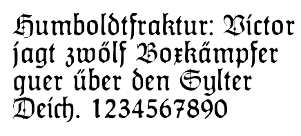
In these figures, the German sentence that appears after the names of the fonts (Walbaum-Fraktur in Fig. 1 and Humboldfraktur in Fig. 2) reads, "Victor jagt zwölf Boxkämpfer quer über den Sylter Deich". It means "Victor chases twelve boxers across the Sylt dike" and contains all 26 letters of the alphabet plus the umlauted glyphs used in German, making it an example of a pangram. Note that in the second specimen, the "t" in "Humboldt" is omitted.[edit] See also
|


Tidak ada komentar:
Posting Komentar